更好的提示 = 更好的结果,更快的速度
与 v0 合作就像与一位技艺高超的队友一起工作,他可以构建你所需要的任何东西。v0 不仅仅是一个工具,更是你的构建伙伴。就像与任何优秀的合作者一样,你获得的成果质量取决于你沟通的清晰程度。
你的描述越具体,v0 的输出效果就越好。根据我们的测试,优质的提示通常能带来:
- Faster generation time (30-40% faster with less unnecessary code, fewer credits spent)
- Smarter UX decisions (v0 understands intent and optimizes accordingly)
- Cleaner, more maintainable code
This guide shows you a framework that consistently produces these results.
驱动优质提示的三个输入
After building hundreds of applications ourselves and learning from v0 ‘s power users, we’ve noticed that the best prompts always include three core inputs:
- Product surface
- Context of use
- Constraints & taste
Here’s the template:
Build [product surface: components, data, actions].

Used by [who],
in [what moment],
to [what decision or outcome].

Constraints:
- platform / device
- visual tone
- layout assumptions
Let’s break down each input.
产品界面
你具体在构建什么?
列出实际的组件、功能和数据。不要只说“一个仪表盘”,而是要说明它展示哪些数据,用户可以进行哪些操作,以及主要的版块有哪些。
Example:
Dashboard displaying: top 5 performers with
names and revenue, team revenue vs quota
progress bar, deal pipeline with stages
(Leads → Qualified → Demo → Closed),
6-month revenue trend chart.
When you’re specific about the product surface, v0 doesn’t waste time inventing features you don’t need or missing ones you do.
使用场景
谁在使用这个产品?他们是在什么时刻使用?
请具体说明你的用户,以及他们在现实生活中如何与产品互动。他们的角色、技术熟练程度、时间限制和所处环境都会影响 v0 的用户体验设计。
Ask yourself:
- Who uses this?
- When do they use it?
- What decision are they trying to make?
- How much time do they have?
Example:
Sales managers (non-technical) who check
this during morning standups on desktop
monitors to quickly spot underperformers and
celebrate wins with the team.
v0 optimizes for assumed usage. If you don’t define the context of use, it will guess.
约束与偏好
How should it work and look
约束条件告诉 v0 不要凭空创造内容。
Include:
- Style preferences
- Platform or device assumptions
- Layout expectations
- Color systems
- Responsiveness or accessibility needs
Example:
Professional but approachable. Use card-based
layout with clear hierarchy. Color code: green for
on-track, yellow for at-risk, red for below target.
Desktop-first since they use large monitors. Make
it feel like a real SaaS product.
v0 ’s defaults are good. Specific constraints make them great while keeping code cleaner.
显示差异:真实测试结果
I tested this framework by building the same applications with different levels of context. Each test isolates one element to show its impact:
Without context of use:
Build an e-commerce site with product grid, filters, and shopping features.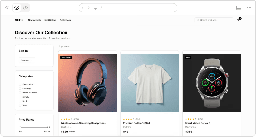
v0 chat: https:// v0.link/6vSzuSI
With context of use:

v0 chat: https:// v0.link/CcOTmsI
What changed:
The version with context took 26 seconds longer but delivered a completely functional product. The version without context had:
- Non-functional search (placeholder only)
- Non-functional cart
- NOT responsive
The version with context had:
- Fully functional search and cart with quantity controls
- 100% mobile responsive
- Sophisticated mobile-first design
- Quick view modals and category filters
The real cost:
Without context would have required 1-2 more prompts to add the missing functionality, totaling ~5 minutes and ~1.5 credits. Better context saved multiple iterations.
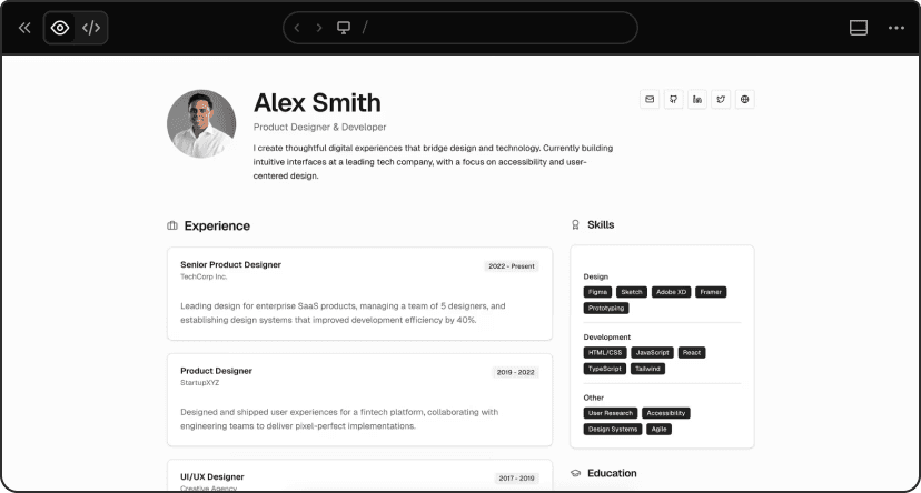
Vague product surface:
Build a user profile page.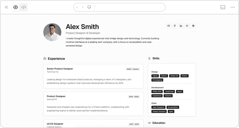
v0 chat: https:// v0.link/1Gev1Gi
Specific product surface:
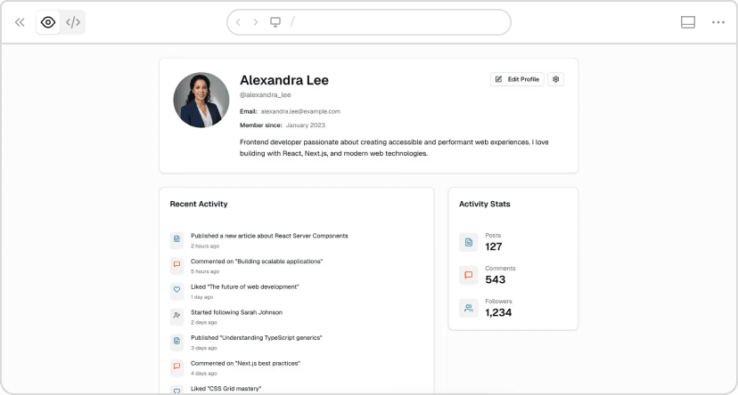
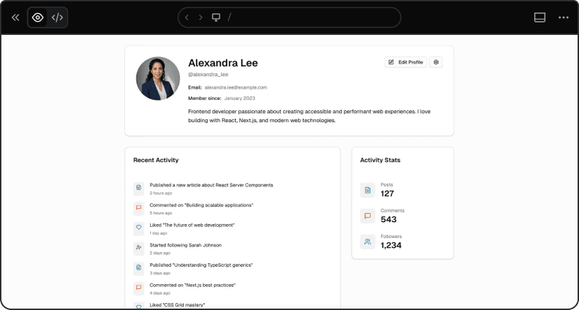
v0 chat: https:// v0.link/690wE6f
Results:
- Vague: 1m 38s, 595 lines, 0.173 credits
- Specific: 1m 19s, 443 lines, 0.160 credits
19 seconds faster, 152 fewer lines, lower cost.
The vague prompt forced v0 to guess. The specific prompt generated exactly what we needed: all requested fields properly structured, activity stats prominent, correct information architecture.
When the product surface is explicit, v0 doesn’t waste time inventing features you don’t need or missing ones you do.
Basic constraints:
Build a support ticket dashboard. Shows: open
tickets, response time, agent performance,
recent activity.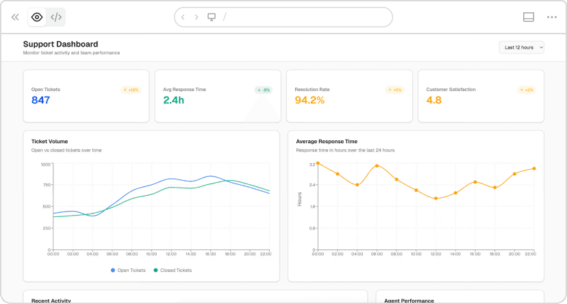
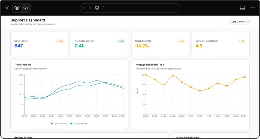
v0 chat: https:// v0.link/jrNW2FX
Detailed constraints:
Build a support ticket dashboard. Shows: open tickets,
response time, agent performance, recent activity.

Mobile-first design (team leads check this on phones
while on the floor).
Light theme, high contrast. Color code: red for urgent
(>24h), yellow for medium, green for on-time. Maximum
3-column layout. Include loading states for real-time data.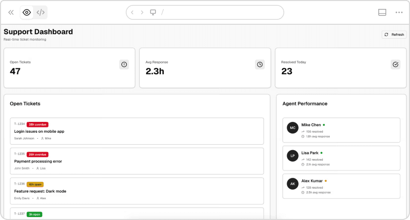
v0 chat: https:// v0.link/ZtsFTeb
Results:
- Basic: 1m 42s, 679 lines, 0.133 credits
- Detailed: 1m 52s, 569 lines, 0.130 credits
Took 10 seconds longer but generated 110 fewer lines and cost less.
The difference: basic version “works on mobile” (desktop layout that shrinks). Detailed version is “mobile-first” (designed from the ground up for mobile, single column expanding to 3 max, intentional color coding with red/yellow/green urgency levels, agent status badges, high contrast for outdoor visibility).
v0 ‘s defaults are good. Specific constraints make them great while keeping code cleaner.
迭代生成结果
Once v0 generates your app, you have two main ways to iterate:
Prompt for changes: Describe what you want to change, add, or remove. Best for functional changes, adding features, or restructuring layouts.
Design Mode: Click Design Mode, select any element visually, and adjust properties directly. Faster for quick visual changes like colors, spacing, or typography.
Use prompts for logic and structure. Use Design Mode for visual tweaks.
Here’s the template again, this time with a fully expanded example:
Template:
Build [product surface: components, data, actions].

Used by [who],
in [what moment],
to [what decision or outcome].

Constraints:
- platform / device
- visual tone
- layout assumptions
Example:
Build a support dashboard showing: open tickets count,
average response time, tickets by priority (high/medium/low),
agent performance list with current workload, recent ticket activity feed.

Used by support team leads (managing 5–10 agents),
on their phones while walking the floor,
to prevent agent burnout and maintain response-time SLAs.
Checked every 30 minutes to identify overloaded agents
and redistribute work.

Constraints:
Mobile-first, light theme, high contrast.
Color code by priority: red for urgent, yellow for medium, green for low.
Show agent status badges (busy/available).
Maximum 2 columns on mobile.- v0 Documentation - Complete guide to all features
- Design Systems Guide - Learn how to create and use design systems
- Project Instructions - Set up rules that apply to all generations
- v0 Templates - Pre-built starting points for common use cases
- Community Platform - Ask for help, share prompt ideas, and chat about AI projects with the community